InsightsDesign for AllEssay
Can accessibility and beauty belong to the same design?
Design for accessibility and beauty
An aid that works but is not liked ends up in a drawer: the lesson of a 2016 hackathon with people with rheumatoid arthritis. From testing products on the market to dignity as the unknown quantity in design, through to ten criteria for designing beautiful aids and the solutions that have followed.
· updated 7 min read
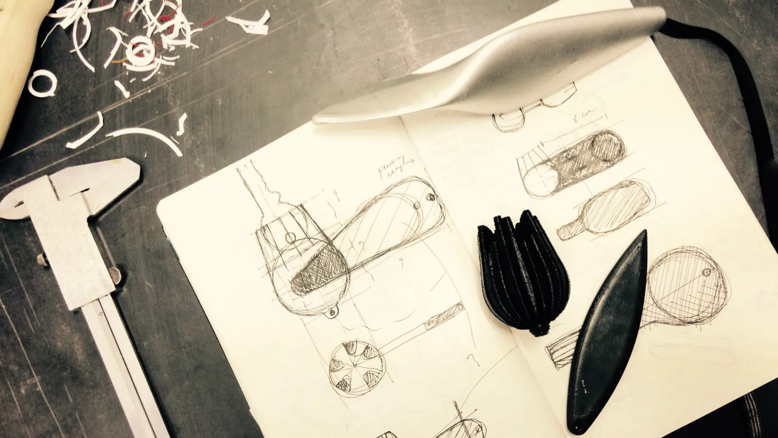
An aid that works but is not liked ends up in a drawer: those who have a choice do not use it. This was the clearest lesson to emerge from a Co-Design experience with people with rheumatoid arthritis in 2016. It gave a name to a criterion the studio had been applying since the Prime washbasin, and one we have tested in every project since: accessibility is not complete unless it also provides comfort, well-being and dignity, not just form and function.
1. It works. But I don’t use it because I don’t like it.
In February 2016 Thinkalize (and later Prodevo (opens in a new tab)), Ipasvi (now OPI, Ordine delle professioni infermieristiche (opens in a new tab), the Italian professional body for nurses) and Paco (opens in a new tab) organised a hackathon at the Fablab Brescia (opens in a new tab) with people with rheumatoid arthritis (opens in a new tab). It was an opportunity to have participants try out a number of products already on the market and to gather data for developing new objects or improving existing ones. We recorded observations on how the products worked, on comfort, and on participants’ impressions and personal comments. All the tools had been chosen on the basis of issues raised by the participants themselves: turning keys, opening bottles or jars, holding cutlery.
What really stood out was the reaction of one participant. Although she acknowledged that some of the products solved an everyday problem for her, she stated openly that she had no intention of buying them or using them, not even at home. She found them unpleasant and a source of embarrassment. In the case of the key turner, she also pointed out that, for this very reason (as well as its size), it was impossible to carry around, even in a handbag.
2. Designing for the real individual. Solving problems is not enough.
Clearly, these projects cannot be reduced to mere functionalism; rather, functionalism becomes the prerequisite for addressing far more important questions: understanding the user, how they want to feel, the occasions on which a tool is used, how people behave with it, and so on. In short, understanding the user’s emotions and personal needs is fundamental in this kind of project.
So setting out to solve a problem without considering how much pleasantness matters seems to confirm that the design is flawed. An unpleasant product goes unused, even if it is given away and performs the required function perfectly. Nobody wants a “ghettoising” product, whether it is industrial, handcrafted, DIY or open source. People who do use one do so because their condition leaves them no choice or, at worst, because they cannot afford anything better. The words used to present these products can also exclude: we have written about this in Designing for “the disabled”, the “differently abled”, people with disabilities.
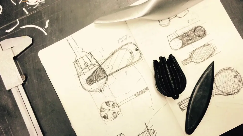
Brescia hackathon with people with rheumatoid arthritis: the first test session
3. A multitude of aids: research is needed to avoid reinventing the wheel.
In this field, as in others, research before design is important. In design for accessibility it is essential, because the range of aids and tools for people with temporary or permanent disabilities is truly vast. The problem is that information is not as accessible (ironically) as it is in mainstream design. Many tools have highly specialised or improbable names; the products on the market are found online on old, abandoned websites or, worse still, have no reference image at all.
It is therefore advisable to visit an assistive technology centre to understand the range of the most common solutions, and to carry out long, thorough research online to find out what already exists and how the problem has been solved. This can take considerable time. Otherwise, many accessibility projects end up as mere reworkings, restyled versions of existing products where you can play spot the difference.

4. Dignity as an unquantifiable variable.
Once again, Design for All proves to be the best approach for this kind of design, because it puts people’s dignity first and tests the design with them, not against a list of requirements. It shares this attention to the real person with Inclusive Design, a distinct and equally important approach. Design for All constantly pushes you towards a sharper design sensitivity, which often leads to a successful result. In some cases the inclusive qualities go unnoticed altogether, and the design fits naturally into mainstream design.
So it becomes possible to turn an aid into a gadget, an accessory into a decorative feature. Does that seem a small thing? But the real open question is this: how do you quantify dignity?
5. A Design for All solution + Poetry = Bingo!
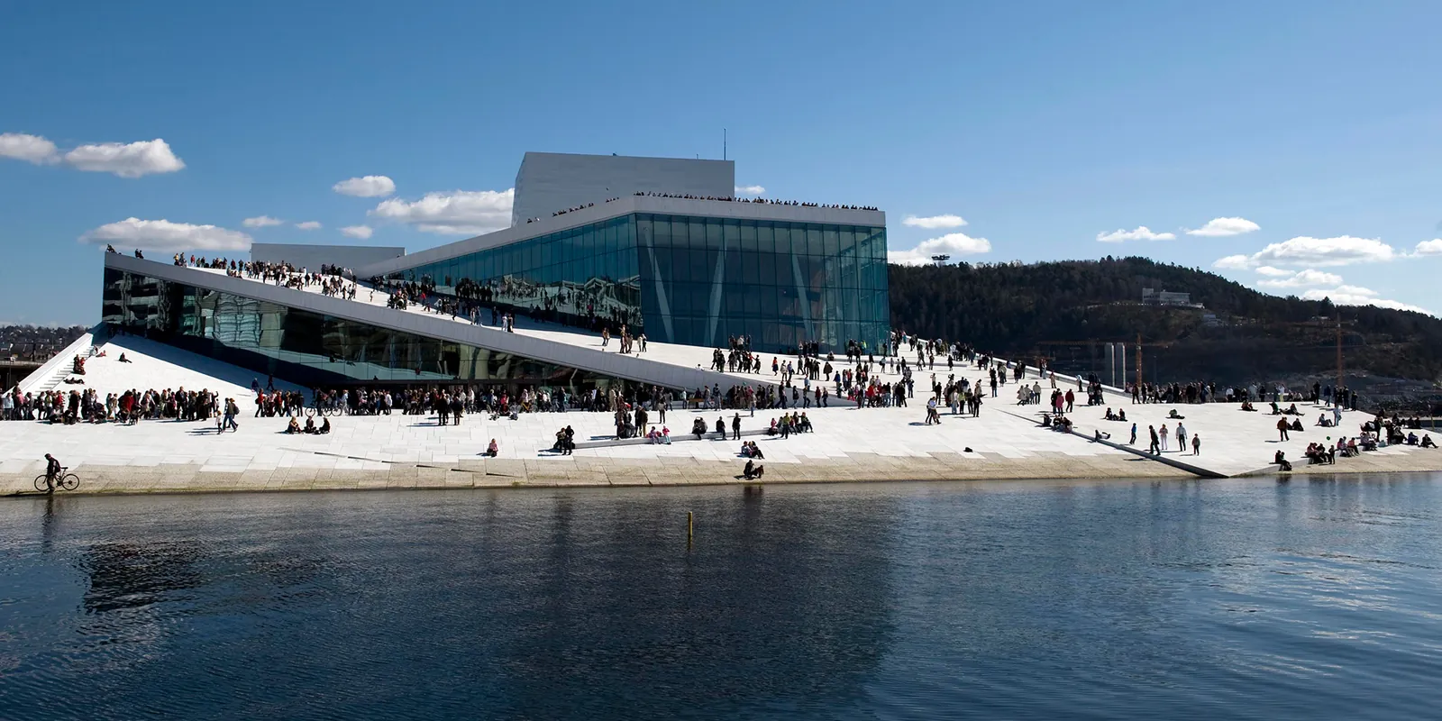
In 2015 I attended a lecture on the Design for All course at the Politecnico di Milano. Avril Accolla (opens in a new tab) gave a talk in which she presented an exemplary project showing how inclusion can be developed through design.
The sloping plaza of the Oslo Opera House (opens in a new tab) (Snøhetta, 2008): a project that gets people talking, perhaps even arguing, but the point lay elsewhere. It was simply the pretext for expressing a far-sighted idea, not a new one, but remarkably concise and effective: “If you add Poetry to a Design for All project, you’ve hit Bingo” (our translation). For professionals it may be a statement of the obvious, but industrial reality strips away the poetry, burdening the product with the obstacle of its own unpleasantness and depriving it of its function, understood as its very reason for being.
6. Ten criteria for designing beautiful aids
- Talk to people and learn from them (see Hackability, which is a statement in itself).
- Carry out long, thorough research into existing products and solutions.
- Start from a design or system that works, and adapt its form to the needs and the context.
- Design as if you were designing for yourself, or for the best company there is.
- Remember that the human body is a tool, and every part of it can help you.
- Do not always try to hide or camouflage the product: sometimes visibility can be an advantage.
- Remember that disability varies, and personalisation matters.
- Use whatever technology is most useful to you.
- Check and test your designs with end users: they will give you the best suggestions. It is one of the cornerstones of the Design for All process.
- If you can, make your design open source.
Ten years on
That observation has become a test for every one of our projects, before and after 2016: it works, but would anyone want to use it?
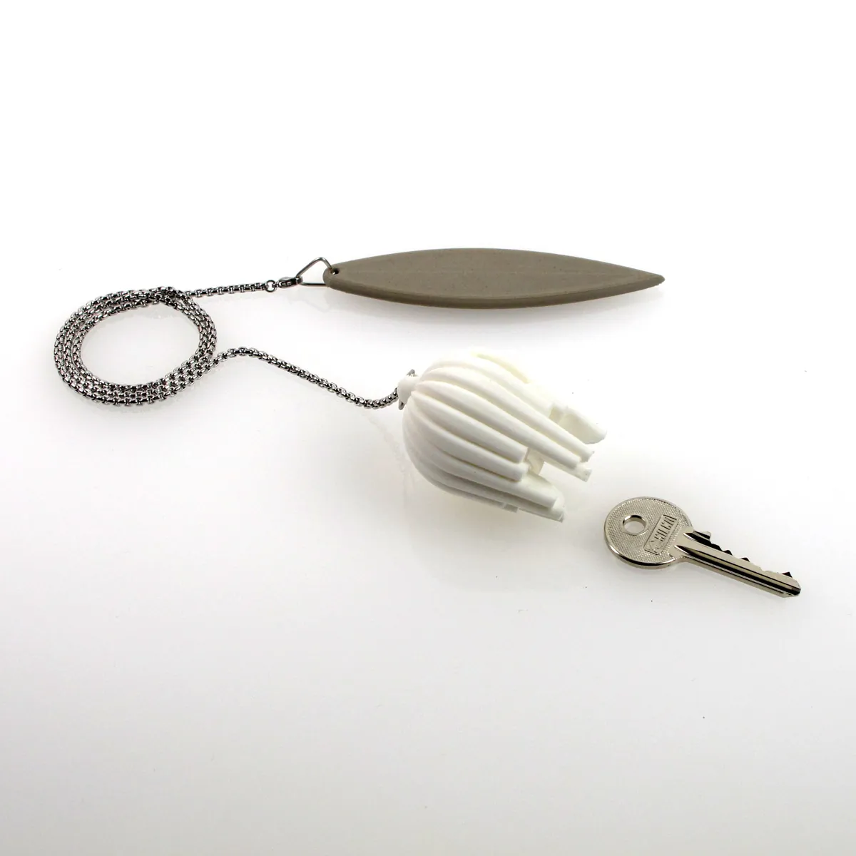
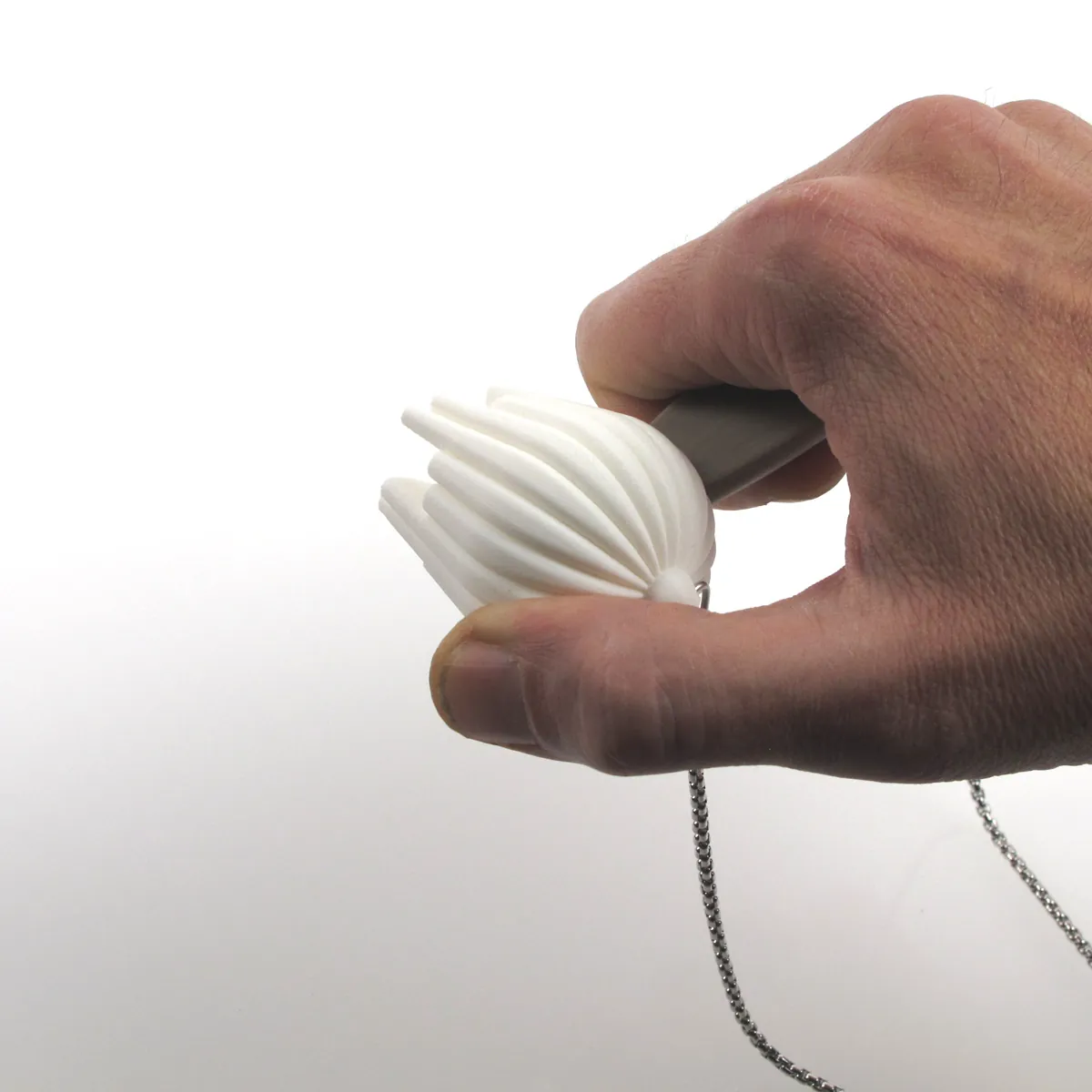
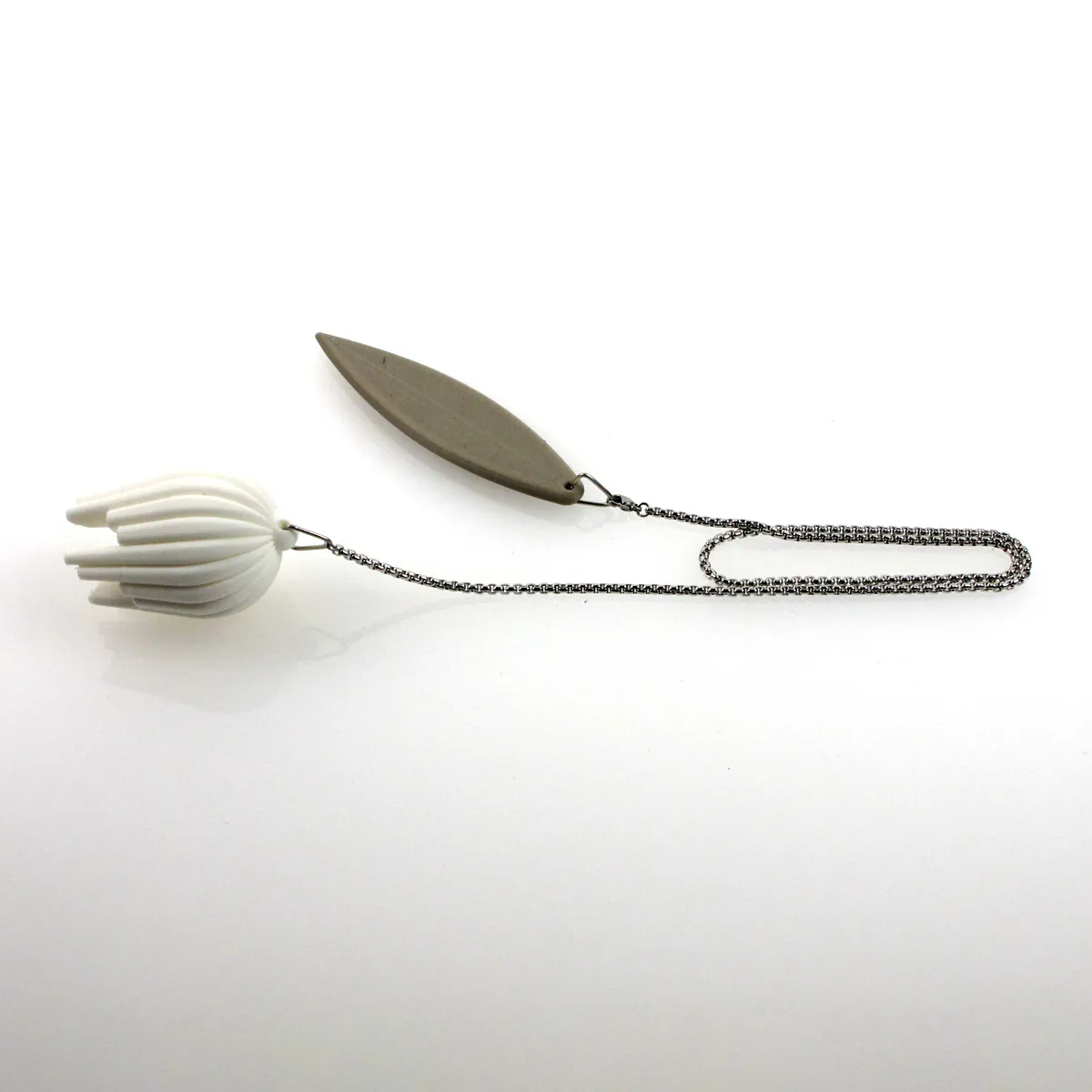
- The 3D-printed Tulip key turner answers the objection that started it all: it is carried on a chain, as an object to show rather than to hide.
- The Prime countertop washbasin, developed with Goman, respects both the accessibility regulations and the dignity of the people who use it.
- The Giotto grab rails stem from the wish of people who need a safety aid to have an accessory in their bathroom, not a piece of medical equipment.
- The Shade fold-down grab rail puts the needs and emotions of people, including people with disabilities, at the centre.
These are solutions that people love, and that is why they use them. The same argument has been made internationally by Graham Pullin in Design Meets Disability (MIT Press, 2009). The relationship between design and exclusion is explored in Design for All: a phenomenology of exclusion; further solutions are collected in our case studies. For companies developing aids or Design for All products: Design for All and Inclusive Design consultancy.
P.S. My heartfelt thanks to Prof. Luigi Bandini Buti (opens in a new tab), mentor and friend. Much grows out of calm dialogue and difficult debate.
Francesco Rodighiero
In our projects
Read next
- News and eventsDesign for All Process: the Florence event of 17 October 2026What did the Design for All Process event in Florence bring together?
- InterviewInclusive design: the Design for All approach on Radio Canale ItaliaWhat is inclusive design, as explained on the radio?
- InterviewFrancesco Rodighiero on Rai Radio 3: Design for All at the heart of the cultural debateWhy is Design for All a cultural issue, not only a technical one?
It works, but would anyone want to use it?
If you’re developing aids or Design for All products, we can test them with the people who’ll use them: how well they work, and whether people actually want to use them.